I’ve really tried to get on board with digital layouts. However, I have some fundamental issues with them that prevent me from getting there.

For myself, crafting is about escaping. I may turn on some music or throw in a DVD for background noise, but then I get into my project and enjoy it because of what it is. I like the textures of the papers and seeing what papers will work where. I like trying something big and having it fail, then I take it all apart and start over having learned what I could do better. In the end, my fingers are frequently covered in paint, chalk, ink, or glue. There are tiny bits of paper that will need to be vacuumed up scattered around my chair. I need all of that. Digital scrapbooking would certainly be neat and clean, but I wouldn’t be pulling away from the computer and it wouldn’t be nearly messy enough.

As for digital layouts I see in the world, I tend to not care much for them either. They can be very beautiful and elaborate, which has a lot of appeal initially. I always seem to be drawn to them at first, but when I look closer they are missing a certain je ne sais quoi. When a person has spent time touching, selecting, gluing, repositioning, stressing and fixing it shows in the final product. You can see the love they felt, the emotion they intended. That is when scrapbooking elevates itself to art for me — when one leaves a bit of soul on the work they’ve done. Digital layouts lack that. The focus is on using all the little pretty things that are not scraps of something else, on the “metal” embellishments that add no depth, on feeling free to use techniques that don’t need to be cleaned up after. I understand what sounds nice about that, but leaving out your heart doesn’t make for better memories. And besides, why would everyone want to create a page that looks so much like everyone else’s page that it looks like nobody in particular created it. That is as irritating in traditional scrapbooking as it is in digital.

That said, I have seen digital scrapbooking that is excellent. It happens when the artist truly expresses who she or he is, when they’ve left a bit of individual style on the page. And when the focus is on the memory and not trying to impress everyone else, things will always feel that much more beautiful.

Judge for yourself. Scrapbook.com has a digital layout gallery.

August was rough. I hope September is better.

I want to do some basic bookmaking. I was thinking a journal or small scrapbook type. The stitching looks confusing, but all the sites I’ve looked at claim it is easier than it seems to be.

I’m looking forward to the cold again. The air has been hinting at fall here.

Many paper companies released Valentine’s Day collections last summer. Those who didn’t only waited until October to do so. That was smart. Now, when Valentine’s is finally on everyone’s minds, those collections can easily be found at many retailers. Maybe it is because I am so bitter over never having had a Valentine of my own, but I hate this holiday. I do more to celebrate Groundhog Day than Valentine’s Day. Because of that, most of the products make me a little bit ill. The ones I put on here do not. In fact, several companies did a really nice job this year with making the day of love more tolerable.

Cosmo Cricket
Chemistry

I love Cosmo Cricket. With Chemistry, they are getting even closer to a Valentine’s line I can stomach. I basically like the colors and the idea behind this one, but it falls on the too-funky-for-me side of things. I may need some for some cardmaking, but I can generally skip this one. I’d still recommend it for Valentine’s that are just a little different. Next time, I’d like to see something edgier from the fantastic people at Cosmo Cricket.
B+

SEI
Lovebirds

I love the bird theme of this V-Day collection. I especially liked the “Love Nest” paper. Great idea. I am not wild about the shade of pink used in this collection though. Even worse, I don’t think the collection coordinates all that well. Since each paper is so unique, they needed to be unified with color and I don’t find that they really are here. These will make great individual sheets to be used on projects, but really don’t do great together, which I feel they really should. SEI paper is always great to work with, so still might be worth your time.
B

Basic Grey
Bittersweet

These are beautiful papers! Browns and pinks still look fresh together and the candy theme is delicious.. hehe. This is a very sophisticated collection that will make Valentine’s layouts really pop. Basic Grey keep getting better at putting together these collections. Negative note: I don’t like the names of the papers, which is rather insignificant to using them.
A-

K & Co.
Brenda Walton’s Sweet Talk

Quintessential Valentine’s Day! This collection is so perfect. It reminds me of being a kid and checking my white paper bag to see if I had received any Valentines that day. If you want to do it traditionally, this is the way to go! Quite likely my favorite of the Valentine’s Day paper collections this year, if only for the nostalgia.
A

Making Memories
Love Notes

Like Valentine’s Day at great-grandma’s house, but not necessarily in a bad way. I actually quite like the “Doily Hearts” paper and the “Sampler” paper. It is a nice collection that goes very well together and makes great use of kraft paper, which is one of my weaknesses. I love kraft paper! I think this is a solid collection from MM. They may not make me jump up and down, but the never disappoint me either.
B

I’ve been digging through websites in an attempt to catch previews of the upcoming releases from various craft companies. CHA is at the end of this month and I haven’t been able to hold out. Tim Holtz is clearly not offering any previews. I was hoping, but I’m hardly surprised. 7gypsies has a preview coming soon and I’m very curious.

I did see the new releases from Cosmo Cricket and I’m really excited to get my hands on some of it! They did a great job of creating some new collections. I’d really like to see another Wanted or Gretel come out during the Summer CHA, but these new ones will look great in my crafting for a while.

Snorkel
This new collection is bright a fun, but with far more depth than the releases a year ago. It is vintage Cosmo Cricket, with weathered edged papers and beautifully coordinating colors. I’m not a fan of the beach myself, but I can’t help loving this. I was immediately drawn to the claw brackets journaling tag and the “Current” paper. I’m going to make a lot of use of this paper for punches of color in my projects.
A

Everafter
I love the Everafter collection. Not only will it make for beautiful wedding themed cards and layouts, but would be great as a framed group of papers. They have a smaller pattern than I would normally use, but I still really like the patterns they do have. The best part is that Cosmo Cricket released a collection that is in the colors I am currently using in my home. Greys, whites, oranges, and blues are beautiful together. I look forward to picking up a lot of this paper as soon as it is available.
A+

Lil’ Man
This collection is really just an expansion and revision of Lil’ Boys from the Biography 101 collection. I like its simplicity; it has a wonderfully vintage feel and doesn’t beat you over the head with masculinity. Since Lil’ Boys is an 8×8 paper pad, this 12×12 collection will go really well with it or will look nice by itself. I’m really taken with “Dapper Dan” and “Handsome Henry.”
B

Girl Friday
My least favorite of the new Cosmo Cricket releases, this collection ain’t too shabby. School girls are such an easy scrapbooking subject and this group of papers works well for that very purpose. Whereas Lil’ Man is an expansion of an existing collection, Girl Friday is an entirely new collection. While I doubt I make use of any of the papers in this collection, the Girl Friday Elements are a must-have for my scrapbooks. I will overbuy these as soon as I can.
B-

Along with these new full collections, Cosmo Cricket also is releasing spinner cards, which are kinda fun, and two new blackboard albums. Scarlet is great, but the shape has been done by Basic Grey very recently. The Flirt album is pretty much useless to me. It has a very small surface area and its shape is too funky for me.

There is so much coming in the crafting world. I’m much more excited by what I see than I was during most of 2008. It seems cool is coming back again!

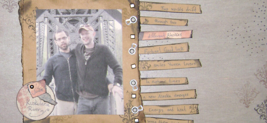
I’ve been focused on crafting lately… cardmaking and scrapbooking in particular. I’m trying to do things that are unique to me, but sometimes it is hard to find stuff that doesn’t end up making my pages look like everyone else’s. I’d also like to get into artist trading cards (both collecting and making them). I only wish this stuff hadn’t gotten so expensive recently. I’ve been putting stuff on scrapbook.com to get some feedback… there are some really talented people on that site. I’ll probably put stuff on Craftster soon too, but haven’t done much on there yet.

my scrapbook.com gallery
Tim Holtz (I love grungeboard!)
Cosmo Cricket
Paperwishes
Martha Stewart Crafts

SaveSave

My newest obsession. Amy Butler is a designer with some amazing lines of fabric and paper craft supplies. I discovered her designs last week (though I had seen them before — I just didn’t know that they were designed by her). I’ve been working on some art for my wall. I want to wrap a canvas in fabric and add a large letter in the center. There are three of them, which will spell out the word “sly.”

All parts of this took a long time to decide on. The longest part was the fabric. I was browsing through magazines on my lunch break during one of my last days at Borders. On the cover of one was a tablecloth in a great damask pattern. I thought it would look great, but assumed that it would be difficult to find something like it. I purchased the magazine anyway.

Inside, I found that the cover story was not only about the fabric used on the tablecloth, but about Amy Butler herself. All the projects were based on designs in her fabric line for Rowan fabrics. As soon as I got home, I searched for the fabrics online. Of course, the ones I liked the most were very difficult to find. But I eventually did. I found Duck Egg Acanthus (the one from the tablecloth) and Teal Acanthus on one site and Olive Acanthus on a different site. I ordered plenty of each to make sure I would be able to use the extra length for pillows, curtains, etc to bring everything in the room together.

The other day, I received the Duck Egg & Teal. These are the softest cotton fabrics I have ever felt. Although they are not nearly as wide as most other fabrics, they are of such great quality and beauty that they are totally worth buying. I am reserving quite a bit of each for use later, but still using some for accents in the living room.

Now, I am on the search for Amy Butler papers for scrapbooking. At Michaels, we sell the album in the Olive Acanthus pattern. I don’t really want a busy patterned album though. I would rather have the paper to use inside.

amy butler’s website
purl’s amy butler collection
crafty planet’s amy butler collection

Images & Featured Image Art: designs from Amy Butler’s “New Belle” collection