This has been a difficult week for me.  On the 28th, I lost my kitty Franz who was born in my living room 16 years ago.  He has been a part of so many moments in my life.  I’m not sure how to express how much he has meant to me, but I can tell you that his absence is very much noticeable.  I miss him.  I miss him waking me up in the morning, cuddling with me while I watch TV, and greeting me when I walk in the door.  I feel guilty that I couldn’t keep him alive, and the whole week has felt like such a blur.

I was 22 when Franz came into my life.  I really feel like my adult life has been defined by him.  And yes, his mama is still with us.  Molly is 6 months older, and she seems to have not really noticed that Franz is gone.  And I’m glad to have her — I don’t mean to take away from her impact on my life, but they had such different personalities.  Franz was a sweetheart.  He was timid and gentle.   Molly more or less tolerates me.  She is independent and self-determined.  And she always gets her way.  I’m trying to think of a creative way to memorialize Franz.  He deserved to live forever, and I want to keep him a part of my life forever.

Highlights from Tumblr

Next week is International Postcard Week.  Check out the website for info.  It’s a bit late, but it’s good info if you are interested in doing it in the future.  In March there is a “National Postcard Week” as well, so get your designs ready!

So, I haven’t been very quick to join these sorts of events, but I don’t have a good excuse.  This time I did join, along with my mom, LaDonna Fuchs, and friend Justin Ward.  Here are our cards for this year.  Once the event is over, I will have the cards available from here to send for free.  Stay tuned….

I watched a TED talk by Roman Mars, the man behind the 99% Invisible blog.  It was on the subject of city flags and I didn’t expect much from it; it had come up on YouTube’s autoplay after a video I had chosen to watch.  I was eating dinner, so I just let it go.  I was immediately hooked and by the end I found myself googling flags for cities where I’ve lived to see how bad they are.  And mostly, they are pretty bad.  I couldn’t get it off my mind, so I went to Photoshop and started to make my own.  As Mars points out in his talk, people are passionate about the flag for the city where they live, and people are usually pretty terrible when it comes to great design.

The loudest voices tend to not understand why a flag like the Union Jack, for example,  is so important for the identity of the United Kingdom.  This was apparent during last year’s call for a change to the city flag of Provo, Utah.  It had long been considered one of the worst, but the proposed change caused controversy.  When opened up to the public, the types of submissions received largely failed to follow the basic principles of design, opting instead to put in some sort of agenda for the city.  Flags are unifying, not political.  In the end, Provo voted for and chose a fantastic new flag, one other cities should be envious of.  But it was an uphill battle, which is somewhat surprising… or should be.

New Zealand is in the midst of a second referendum to change their country’s flag to something divorced from their Australian neighbors.  It was bound to be controversial; the current flag was adopted in 1902.  It seems, however, that the issue is more about people not really caring, and opting to vote for the status quo as a way of making that point.  But the prime minister has a point.  The current flag is nearly identical to Australia’s flag, and like it still has the Union Jack on it.  While New Zealand is a part of the Commonwealth, most countries within it have modified their flags following independence in the 1930s and 1940s.  Canada’s fantastic flag is a great example.  The Union Jack persisted on the flag for a while, but by the mid-1960s, the maple leaf flag had been adopted, cementing a true identity for Canadians, removed from that of the people of the United Kingdom.  They do share a queen, but they do not share a cultural identity.  Their flag drives that point and gives the separate peoples something to make them special.  As for New Zealand, they may choose to keep their current flag.  I personally think they should change it.  The proposed change, chosen in a vote last year, is pretty great.  I would’ve gone further and removed the stars, but it’s still a great looking flag.

Looking at state city flags in the United States, I found a strong tendency to stick the state or city seal in a field of color, usually blue, and call that a flag.  And that looks stupid 100% of the time.  A seal can be a beautiful piece of art, incorporating a surprising amount of history into a (usually) circular emblem.  A flag, however, is not a history of one’s city.  It is a symbolic representation of the city.  It’s an icon, a place reduced to the simplest form possible.  The United States flag is another great example of a former British Colonial flag that came into its own with the removal of the Union Jack.  The thirteen colonies had a flag, similar to the current United States flag, but instead of stars there was the Union Jack.  Changing that portion to a field of blue with a star for each state not only changed the meaning of the flag, but it retained its sense of history.  It acknowledges where we came from, but makes clear that we are no longer a part of the British Empire.

Flag_of_the_United_States.svgThe Great Seal of the United States, which can be seen on any one dollar bill, is beautiful.  It features an eagle clutching an olive branch in one talon, arrows in the other talon, thirteen stars above the eagle’s head and a banner in its beak with the motto e pluribus unum written on it.  The olives, leaves, stars, and arrows all number thirteen to honor the original colonies.  The reverse features a pyramid with the Eye of Providence, featuring annuit cœptis written above and novus ordo seclorum written in a banner underneath.  These symbols on our seal feel very american and very much a part of who we are.  The flag, however, is not that.  It has no motto written across it and the name of our country does not appear at the bottom to remind us of what it is for.  We don’t need that reminder, and because the flag is so simple, and fantastically so, neither does anyone else.
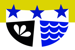
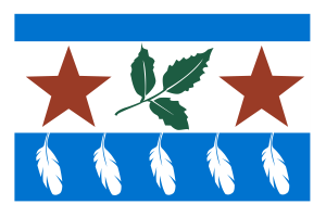
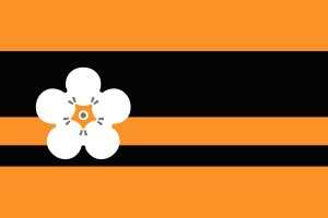
One of my favorite city seals is that of Tulsa, Oklahoma.  It’s a really lovelypiece that must look great on letterhead, on business cards, and affixed to the city’s buildings.  It says a lot about the city in a small space.  But the city’s flag is exactly that seal in the middle of a white flag.  It gets lost.  It has no power there and just fails to generate the power it should as a symbol of a city.  I’ve created my own, one I think that honors the city’s seal while becoming more of a symbol that could be adapted in a lot of ways,  making way for a unifier for a city.  It could be something one is proud to put on a bumper sticker or a a patch on a backpack.  Business could use parts of it to mark themselves as local.  It does, in my opinion, the things a flag should do.

It surprised me how much I cared about flags.  Roman mars had started his TED talk with the assertion that 100% of people care about flags.  I raised an eyebrow at that. I did not think I did care about flag all that much, but I really do.  And I think others do as well.  But I do think it’s harder than people think to create a great flag for a city. It would be nice for these flags to change and a symbol of pride become available for cities whose flags just don’t work.

I haven’t picked on Oklahoma’s state flag much.  The state flag of my state is nice, and the official version from 1925 to 1941 was fantastic.  “OKLAHOMA” was added to the flag in 1941, which was unnecessary.  Supposedly, it was done as a literacy statement, but I’m not really sure how the name of one’s state on a flag truly promotes literacy.  At this point, the lettering could go.  Nobody would confuse the flag with another state’s.  I might also stylize the elements a bit.  I was able to draw the flag when I was a kid, but I remember it being overly intricate.

While I was tackling Tulsa’s flag, I made a whole bunch of flags.  Some of them are for communities that are small enough that they have never had a flag of their own, some are redesigns.  One is even for a community that doesn’t have residents year-round.  All were thought through, giving consideration to the various specifics of the town or city.  And I couldn’t help myself – I made some for fantasy places too.  Let me know what you think.

.

SaveSave

Looking over my past work reminds me of how much I love creating and have greatly missed being able to work the way I’d like.  I’m getting closer to having more space, which will be nice and I hope to have a permanent solution within the next year that will give me both a lot of space and less chaos in my house.
Getting back to my work feels different this time.  I’ve had a lot of time to consider where I am headed, but I don’t know that I arrived at an answer.  I know where I see myself, but it just doesn’t feel as real as I would like.  Maybe I’m just letting fear do my speaking for me.  There certainly isn’t any reason why I cannot achieve those things I dream about.  And there is certainly no reason my art couldn’t propel me into where I want to be.  When I am open to it, I love my art.

On that note, it is amazing how much my art reflects what is going on in my life.  Over last summer, when life seemed really relaxed, I was able to create very easily and had a lot of fun.  Over the past couple of months, on the other hand, my drawings seem off and I haven’t picked up a paint brush since December.  I don’t feel inspired.  I feel claustrophobic, stuck, pushed down.  And that is easily explained.  I started feeling odd December 15, which developed quickly into the flu, which lasted for a couple of weeks and then turned into pneumonia.  I’ve technically been well for a month now, but I’m still coughing things up, and I have yet to feel as energetic as I did early in December.  It’s so hard to stay positive through that.  Meanwhile, I’m trying to coordinate new flooring in my house.  The boxes of flooring are waiting on my porch and I have to move as much as possible from the house into the shed.

I don’t mean to complain.  I don’t like complaining.  My point is that I’ve just been in such a non-creative headspace.  I am looking forward to a year full of art, life, and family.  I want it to be a productive and successful year.  I’m looking at 2016 as the year that prepares my life to make sense.  2017 is looking like a year when I can just relax.  I’ve been in a state of flux and upheaval for 3 years now.  Settling down is going to be amazing.

I’m interested in so many things that I hope to add to my website.  I’m looking into hand painting plates and glasses, various types of collage, painting canvases, having cards printed, and making ornaments for Christmas.  I’m also super-obsessed with all things fairy garden, but I’m terrible with plants.  I’m brainstorming a way to use the concept of the fairy garden/house to make something more “Brian” in nature.  A few years ago, I made these caged fairy animals as gifts.  That was fairy similar, but I think I can take this idea a little further.  There is just so much to think about and so much to do.  I hope you enjoy this blog.  Feel free to message me with things you’d like me to write about or any suggestions on art to try.


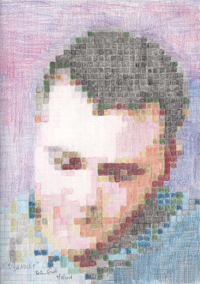
I did this drawing as a birthday present for Bradley, my brother.  I like the result.  I might have to try doing more like this.
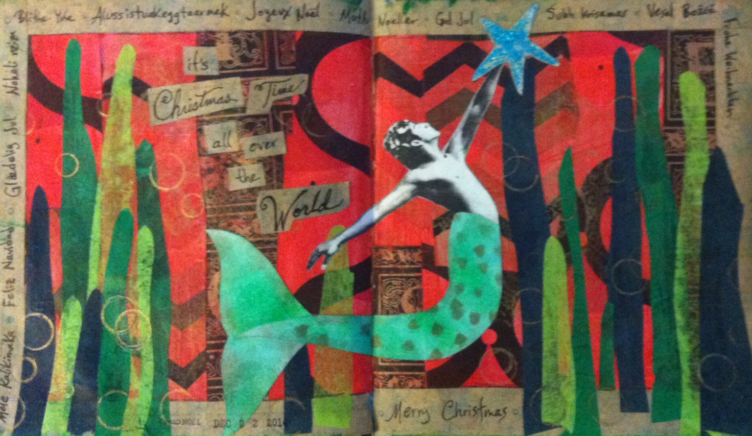
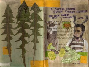
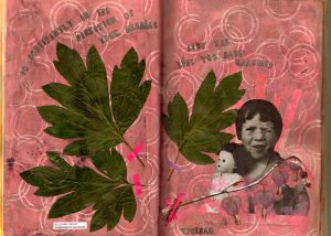
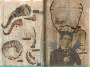
I’ve been very into Art Journals lately. I’ve started several of my own, but have been most focused on my nature journal. There is always so much I want to capture about Alaska in the summer, but I let it slip past me and by January I wish I had recorded the greenness that I have started to miss. A trip to the zoo recently sparked this particular journal. It wasn’t so much the animals, but the beauty of the zoo itself. If you’ve been the Alaska Zoo, you will understand. Here are the pages I’ve completed so far. Feel free to comment and leave suggestions. I’m new to this and welcome criticism.

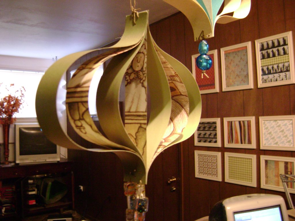
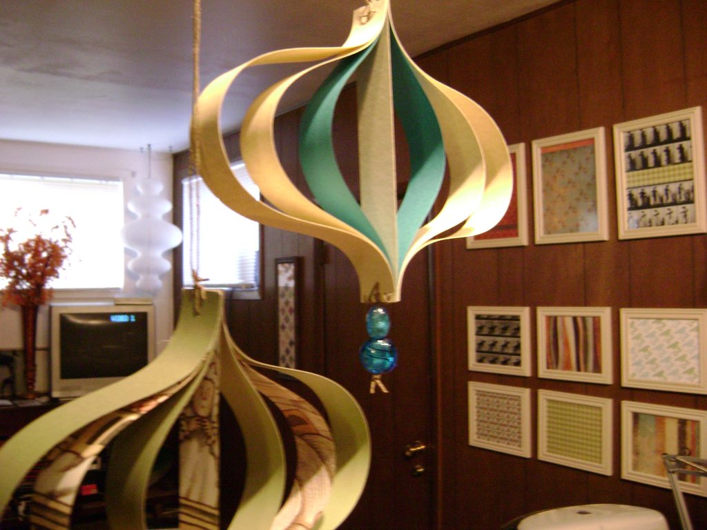
Well, probably not. But I did like these paper ornaments that I made. I think I’ll make sets of them to sell, but I’m not sure if I should make them and require that the person buying them put together the top part or if I should sell them already assembled and just charge the extra shipping. I’d like to assume people aren’t stupid, but… hmm.

I have been searching the corners of the earth for seahorse stamps. So far, I’ve purchased two. I will stop after 2 or 3 more. I really need a variety and a variety of sizes to really make the most use of them. My search brought several really great sites into my radar too. In the spirit of sharing (which I hear is a good thing), here’s a little list of the craft sites I like:

}}starlit studio :: all my favorite companies on one site. tim holtz is my new favorite person.
}}purl soho :: if you need yarn or fabric, go here first.
}}scrap your trip :: there is so much more to it than that! good deals and reasonable shipping rates to alaska
}}gorey details :: i’m not into most of the stuff on this site, but they have some really different rubber stamps. i bought 2. lots of fun edward gorey stuff.
}}river city rubber works :: some really beautiful stamps. a bit pricey, but if they’ve got what you want, they are probably the only ones who do.
}}rubber stamp plantation :: for all your hawaiian needs. okay, i don’t need much from this site. they have a really amazing seahorse and many many many…. MANY turtles to choose from.

Many paper companies released Valentine’s Day collections last summer. Those who didn’t only waited until October to do so. That was smart. Now, when Valentine’s is finally on everyone’s minds, those collections can easily be found at many retailers. Maybe it is because I am so bitter over never having had a Valentine of my own, but I hate this holiday. I do more to celebrate Groundhog Day than Valentine’s Day. Because of that, most of the products make me a little bit ill. The ones I put on here do not. In fact, several companies did a really nice job this year with making the day of love more tolerable.

Cosmo Cricket
Chemistry

I love Cosmo Cricket. With Chemistry, they are getting even closer to a Valentine’s line I can stomach. I basically like the colors and the idea behind this one, but it falls on the too-funky-for-me side of things. I may need some for some cardmaking, but I can generally skip this one. I’d still recommend it for Valentine’s that are just a little different. Next time, I’d like to see something edgier from the fantastic people at Cosmo Cricket.
B+

SEI
Lovebirds

I love the bird theme of this V-Day collection. I especially liked the “Love Nest” paper. Great idea. I am not wild about the shade of pink used in this collection though. Even worse, I don’t think the collection coordinates all that well. Since each paper is so unique, they needed to be unified with color and I don’t find that they really are here. These will make great individual sheets to be used on projects, but really don’t do great together, which I feel they really should. SEI paper is always great to work with, so still might be worth your time.
B

Basic Grey
Bittersweet

These are beautiful papers! Browns and pinks still look fresh together and the candy theme is delicious.. hehe. This is a very sophisticated collection that will make Valentine’s layouts really pop. Basic Grey keep getting better at putting together these collections. Negative note: I don’t like the names of the papers, which is rather insignificant to using them.
A-

K & Co.
Brenda Walton’s Sweet Talk

Quintessential Valentine’s Day! This collection is so perfect. It reminds me of being a kid and checking my white paper bag to see if I had received any Valentines that day. If you want to do it traditionally, this is the way to go! Quite likely my favorite of the Valentine’s Day paper collections this year, if only for the nostalgia.
A

Making Memories
Love Notes

Like Valentine’s Day at great-grandma’s house, but not necessarily in a bad way. I actually quite like the “Doily Hearts” paper and the “Sampler” paper. It is a nice collection that goes very well together and makes great use of kraft paper, which is one of my weaknesses. I love kraft paper! I think this is a solid collection from MM. They may not make me jump up and down, but the never disappoint me either.
B

I’ve been digging through websites in an attempt to catch previews of the upcoming releases from various craft companies. CHA is at the end of this month and I haven’t been able to hold out. Tim Holtz is clearly not offering any previews. I was hoping, but I’m hardly surprised. 7gypsies has a preview coming soon and I’m very curious.

I did see the new releases from Cosmo Cricket and I’m really excited to get my hands on some of it! They did a great job of creating some new collections. I’d really like to see another Wanted or Gretel come out during the Summer CHA, but these new ones will look great in my crafting for a while.

Snorkel
This new collection is bright a fun, but with far more depth than the releases a year ago. It is vintage Cosmo Cricket, with weathered edged papers and beautifully coordinating colors. I’m not a fan of the beach myself, but I can’t help loving this. I was immediately drawn to the claw brackets journaling tag and the “Current” paper. I’m going to make a lot of use of this paper for punches of color in my projects.
A

Everafter
I love the Everafter collection. Not only will it make for beautiful wedding themed cards and layouts, but would be great as a framed group of papers. They have a smaller pattern than I would normally use, but I still really like the patterns they do have. The best part is that Cosmo Cricket released a collection that is in the colors I am currently using in my home. Greys, whites, oranges, and blues are beautiful together. I look forward to picking up a lot of this paper as soon as it is available.
A+

Lil’ Man
This collection is really just an expansion and revision of Lil’ Boys from the Biography 101 collection. I like its simplicity; it has a wonderfully vintage feel and doesn’t beat you over the head with masculinity. Since Lil’ Boys is an 8×8 paper pad, this 12×12 collection will go really well with it or will look nice by itself. I’m really taken with “Dapper Dan” and “Handsome Henry.”
B

Girl Friday
My least favorite of the new Cosmo Cricket releases, this collection ain’t too shabby. School girls are such an easy scrapbooking subject and this group of papers works well for that very purpose. Whereas Lil’ Man is an expansion of an existing collection, Girl Friday is an entirely new collection. While I doubt I make use of any of the papers in this collection, the Girl Friday Elements are a must-have for my scrapbooks. I will overbuy these as soon as I can.
B-

Along with these new full collections, Cosmo Cricket also is releasing spinner cards, which are kinda fun, and two new blackboard albums. Scarlet is great, but the shape has been done by Basic Grey very recently. The Flirt album is pretty much useless to me. It has a very small surface area and its shape is too funky for me.

There is so much coming in the crafting world. I’m much more excited by what I see than I was during most of 2008. It seems cool is coming back again!

My newest obsession. Amy Butler is a designer with some amazing lines of fabric and paper craft supplies. I discovered her designs last week (though I had seen them before — I just didn’t know that they were designed by her). I’ve been working on some art for my wall. I want to wrap a canvas in fabric and add a large letter in the center. There are three of them, which will spell out the word “sly.”

All parts of this took a long time to decide on. The longest part was the fabric. I was browsing through magazines on my lunch break during one of my last days at Borders. On the cover of one was a tablecloth in a great damask pattern. I thought it would look great, but assumed that it would be difficult to find something like it. I purchased the magazine anyway.

Inside, I found that the cover story was not only about the fabric used on the tablecloth, but about Amy Butler herself. All the projects were based on designs in her fabric line for Rowan fabrics. As soon as I got home, I searched for the fabrics online. Of course, the ones I liked the most were very difficult to find. But I eventually did. I found Duck Egg Acanthus (the one from the tablecloth) and Teal Acanthus on one site and Olive Acanthus on a different site. I ordered plenty of each to make sure I would be able to use the extra length for pillows, curtains, etc to bring everything in the room together.

The other day, I received the Duck Egg & Teal. These are the softest cotton fabrics I have ever felt. Although they are not nearly as wide as most other fabrics, they are of such great quality and beauty that they are totally worth buying. I am reserving quite a bit of each for use later, but still using some for accents in the living room.

Now, I am on the search for Amy Butler papers for scrapbooking. At Michaels, we sell the album in the Olive Acanthus pattern. I don’t really want a busy patterned album though. I would rather have the paper to use inside.

amy butler’s website
purl’s amy butler collection
crafty planet’s amy butler collection

Images & Featured Image Art: designs from Amy Butler’s “New Belle” collection