A Chase

I’m a little sore.  My knee was slightly swollen when I woke up, so I need to make sure to not overdo things for a few days and see if that resolves itself.  I didn’t do that much of a walk yesterday, but I was active and on my feet most of the day and the two days before that I did a full three mile walk, so I’m probably just dealing with the consequences of the long break I took from my walks.  

It feels warmer today than the thermometer indicates.  That could just be me; I did wake up in the middle of the night feeling little too hot, but it was only 71º in the house.  

When I got to the park, the only other person there was a woman walking the same path as I walk.  Her pace is much better than mine, especially today, so I kept finding ways to stay out of her way so she never had to cross paths with me.  I think it’s better for others, but it also prevents people from sneaking up on me from behind.  I did get in 20 step ups as a result.  Those feel so good and get my heart really going.  I know I need to add dumbbells; I’m dreading carrying them to the park with me for my walks!  But I will.  There are a lot of things I need to get over.

It’s Brad’s birthday.  He is going for his usual birthday dinner at Cattleman’s.  He’s invited me, and I’m on the fence about it.  On the one hand, I actually do like hanging out with him and that is a good opportunity.  On the other hand, Friday evening at Cattleman’s can mean long wait times for the opportunity to sit and not have anything to eat.  Not that I mind not eating (they don’t serve anything I can have), but it can be annoying for that to be after waiting two hours to be seated.  I’m thinking about it.

Brent’s going to be over this afternoon, and after he leaves for his evening photoshoot, I think I’ll go for a second walk to try to get in my three miles.  Maybe doing it all at once is part of my problem.  Maybe it’s the total.  Maybe it doesn’t have anything to do with my walking.

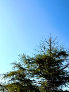
[Walk #336, 2.18 miles]


Playlist

1. Give Life Back to Music, Daft Punk
2. Totem, Zazie
3. Cold Sweat, Hot Boys, Bright Light Bright Light
4. Magic, Kylie Minogue
5. Ding, Jewels Sparkles
6. Play, Jax Jones & Years & Years
7. Come into My World, Kylie Minogue
8. Gaslight, Derik Fein
9. Easy Lover, Miley Cyrus
10. Around the World, Daft Punk
11. Cinnamon, Derik Fein
12. From the Start, Goldenfang Records
13. Any Which Way, Scissor Sisters

I watched a TED talk by Roman Mars, the man behind the 99% Invisible blog.  It was on the subject of city flags and I didn’t expect much from it; it had come up on YouTube’s autoplay after a video I had chosen to watch.  I was eating dinner, so I just let it go.  I was immediately hooked and by the end I found myself googling flags for cities where I’ve lived to see how bad they are.  And mostly, they are pretty bad.  I couldn’t get it off my mind, so I went to Photoshop and started to make my own.  As Mars points out in his talk, people are passionate about the flag for the city where they live, and people are usually pretty terrible when it comes to great design.

The loudest voices tend to not understand why a flag like the Union Jack, for example,  is so important for the identity of the United Kingdom.  This was apparent during last year’s call for a change to the city flag of Provo, Utah.  It had long been considered one of the worst, but the proposed change caused controversy.  When opened up to the public, the types of submissions received largely failed to follow the basic principles of design, opting instead to put in some sort of agenda for the city.  Flags are unifying, not political.  In the end, Provo voted for and chose a fantastic new flag, one other cities should be envious of.  But it was an uphill battle, which is somewhat surprising… or should be.

New Zealand is in the midst of a second referendum to change their country’s flag to something divorced from their Australian neighbors.  It was bound to be controversial; the current flag was adopted in 1902.  It seems, however, that the issue is more about people not really caring, and opting to vote for the status quo as a way of making that point.  But the prime minister has a point.  The current flag is nearly identical to Australia’s flag, and like it still has the Union Jack on it.  While New Zealand is a part of the Commonwealth, most countries within it have modified their flags following independence in the 1930s and 1940s.  Canada’s fantastic flag is a great example.  The Union Jack persisted on the flag for a while, but by the mid-1960s, the maple leaf flag had been adopted, cementing a true identity for Canadians, removed from that of the people of the United Kingdom.  They do share a queen, but they do not share a cultural identity.  Their flag drives that point and gives the separate peoples something to make them special.  As for New Zealand, they may choose to keep their current flag.  I personally think they should change it.  The proposed change, chosen in a vote last year, is pretty great.  I would’ve gone further and removed the stars, but it’s still a great looking flag.

Looking at state city flags in the United States, I found a strong tendency to stick the state or city seal in a field of color, usually blue, and call that a flag.  And that looks stupid 100% of the time.  A seal can be a beautiful piece of art, incorporating a surprising amount of history into a (usually) circular emblem.  A flag, however, is not a history of one’s city.  It is a symbolic representation of the city.  It’s an icon, a place reduced to the simplest form possible.  The United States flag is another great example of a former British Colonial flag that came into its own with the removal of the Union Jack.  The thirteen colonies had a flag, similar to the current United States flag, but instead of stars there was the Union Jack.  Changing that portion to a field of blue with a star for each state not only changed the meaning of the flag, but it retained its sense of history.  It acknowledges where we came from, but makes clear that we are no longer a part of the British Empire.

Flag_of_the_United_States.svgThe Great Seal of the United States, which can be seen on any one dollar bill, is beautiful.  It features an eagle clutching an olive branch in one talon, arrows in the other talon, thirteen stars above the eagle’s head and a banner in its beak with the motto e pluribus unum written on it.  The olives, leaves, stars, and arrows all number thirteen to honor the original colonies.  The reverse features a pyramid with the Eye of Providence, featuring annuit cœptis written above and novus ordo seclorum written in a banner underneath.  These symbols on our seal feel very american and very much a part of who we are.  The flag, however, is not that.  It has no motto written across it and the name of our country does not appear at the bottom to remind us of what it is for.  We don’t need that reminder, and because the flag is so simple, and fantastically so, neither does anyone else.

One of my favorite city seals is that of Tulsa, Oklahoma.  It’s a really lovelypiece that must look great on letterhead, on business cards, and affixed to the city’s buildings.  It says a lot about the city in a small space.  But the city’s flag is exactly that seal in the middle of a white flag.  It gets lost.  It has no power there and just fails to generate the power it should as a symbol of a city.  I’ve created my own, one I think that honors the city’s seal while becoming more of a symbol that could be adapted in a lot of ways,  making way for a unifier for a city.  It could be something one is proud to put on a bumper sticker or a a patch on a backpack.  Business could use parts of it to mark themselves as local.  It does, in my opinion, the things a flag should do.

It surprised me how much I cared about flags.  Roman mars had started his TED talk with the assertion that 100% of people care about flags.  I raised an eyebrow at that. I did not think I did care about flag all that much, but I really do.  And I think others do as well.  But I do think it’s harder than people think to create a great flag for a city. It would be nice for these flags to change and a symbol of pride become available for cities whose flags just don’t work.

I haven’t picked on Oklahoma’s state flag much.  The state flag of my state is nice, and the official version from 1925 to 1941 was fantastic.  “OKLAHOMA” was added to the flag in 1941, which was unnecessary.  Supposedly, it was done as a literacy statement, but I’m not really sure how the name of one’s state on a flag truly promotes literacy.  At this point, the lettering could go.  Nobody would confuse the flag with another state’s.  I might also stylize the elements a bit.  I was able to draw the flag when I was a kid, but I remember it being overly intricate.

While I was tackling Tulsa’s flag, I made a whole bunch of flags.  Some of them are for communities that are small enough that they have never had a flag of their own, some are redesigns.  One is even for a community that doesn’t have residents year-round.  All were thought through, giving consideration to the various specifics of the town or city.  And I couldn’t help myself – I made some for fantasy places too.  Let me know what you think.

.

SaveSave